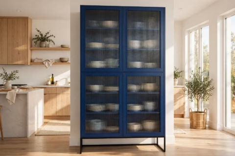
I Stopped Matching My Woods. Here’s the 3-Wood Rule I Use Now.
I used to believe every piece of wood furniture in a room had to match. So when I furnished my first dining room in 2019, I bought the whole set in one finish — same stain, same grain, same everything — and the result looked like a furniture showroom had coughed up a corner of my apartment. Mixing wood tones felt like a rule I would get wrong, so for years I avoided it. Then a designer friend walked in and said the thing nobody else had: “This doesn’t look curated. It looks purchased.” Here is what I have learned since — the 3-wood rule I use now, the undertone science behind wood tone combinations that click, and how to fix a room that is already too matchy.
The matchy-matchy trap: why my dining room looked like a catalog
I did not buy cheap furniture that first time — I bought a full “collection,” one finish, one delivery truck. Table, four chairs, sideboard, all in the same warm oak. In the store it looked coordinated. In my 10×12 dining room it looked like a display vignette I was not allowed to touch. Designers have a word for this — matchy-matchy — and the moment I learned it, I could never unsee it. A room where every wood surface is identical reads as “I bought the set” instead of “I live here.” The matching set costs more and looks cheaper: I paid a premium for coordination and got a room with no depth and nothing for the eye to land on.
It is not the species. It is the undertones.
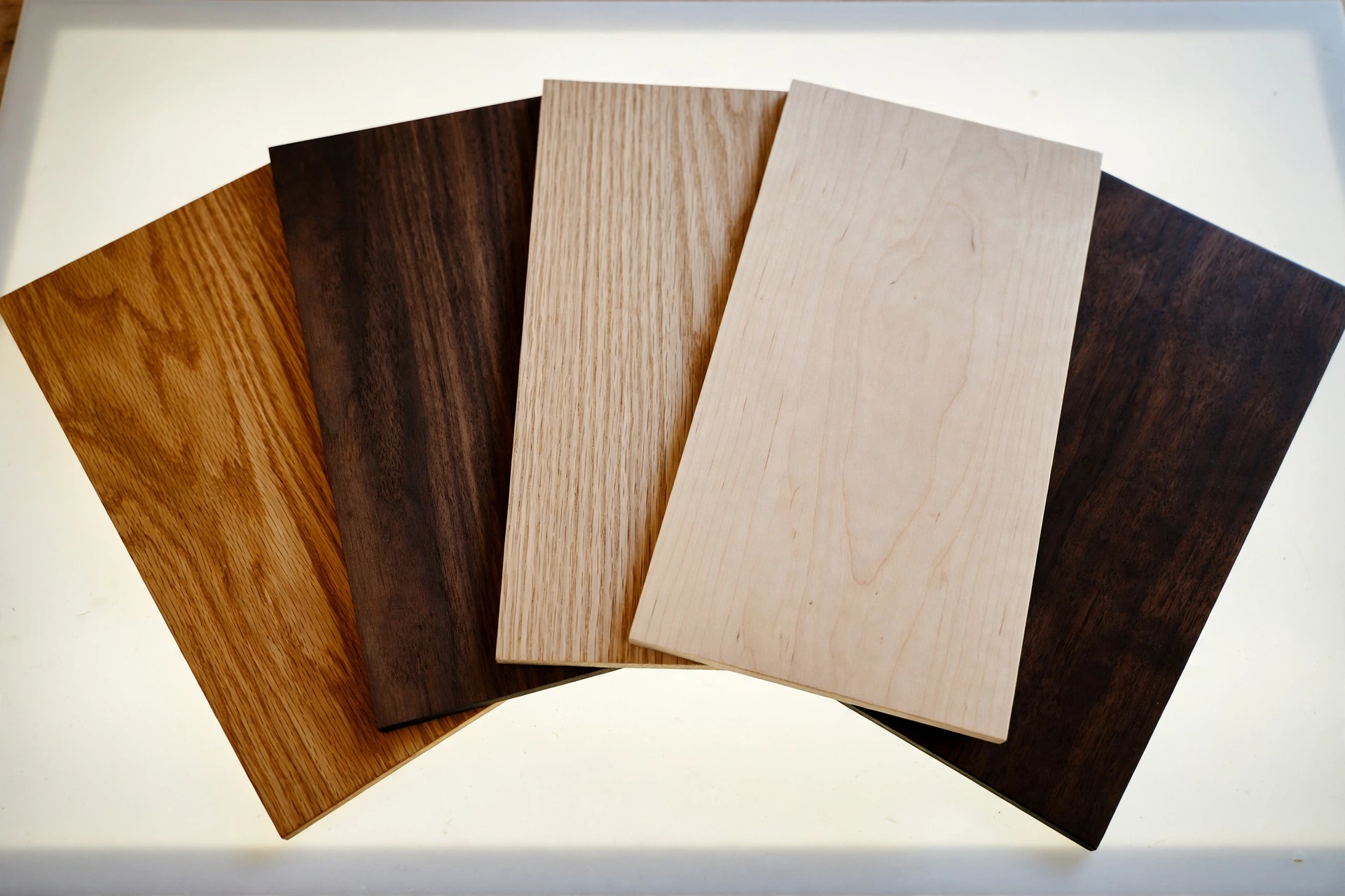
The most useful thing I know about how to mix wood furniture: woods do not clash by species, they clash by undertone. Every wood finish leans warm (golden, red, honey) or cool (gray, ashy, purple-brown). Warm vs cool wood undertones is the real chemistry behind every “this looks off but I can’t say why” moment.
Oak typically runs warm and golden. Walnut runs cooler and darker, often with a purple-brown cast. Maple is pale and neutral-cool. Cherry pulls warm-red. The clash happens when a warm piece and a cool piece fight at equal visual weight — a honey-oak table next to a gray-washed bookshelf, neither winning. But a warm oak next to a warm cherry harmonizes even though the species are unrelated.
The white-paper trick: hold a finish sample next to a sheet of white paper in daylight. The neutral reference makes the undertone jump out — you will suddenly see the pink in “natural cherry” or the gray hiding in “weathered oak.” Do this in the store before you buy, and half of mixing anxiety disappears.
One honest note about species names on product pages: most furniture at real-people prices is MDF or particleboard with printed veneer, not solid hardwood. My $188 weathered-oak Bob Desk lists paper veneer, board, and metal tube as its materials, and it looks great from three feet away. My wood vs metal bed frame test found the same story under upholstery. Stop worshipping species names — match the finish you actually see in your light.
The 3-wood rule: two anchors, one accent
The system: no more than three wood tones per room. Two anchors and one accent. The anchor is the biggest wood piece — the dining table, the bed frame — setting the dominant tone, roughly 60 percent of the wood you see. The secondary is one or two medium pieces at 30 percent. The accent is small doses at 10 percent: a stool, a tray, picture frames. Four tones is where rooms start to feel restless; five is a lumberyard.
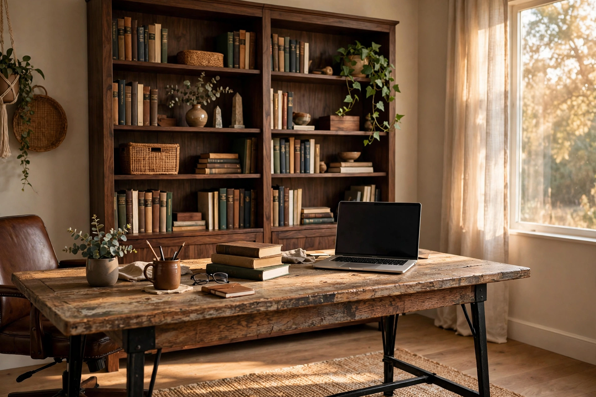
Pick the anchor first and build outward. In my home office the anchor is the weathered-oak Bob Desk — 47 inches long, oak top, black metal legs, $188. The secondary is a dark walnut bookshelf I already owned. The accent: a small honey-oak stool doubling as a side table. Three tones, warm-leaning family, done. The desk’s black metal legs do not count toward the wood budget — metal and painted finishes are free passes, which is why mixed-material furniture is the easiest way to start mixing.
Measure before you fall in love with a combo. I tape every footprint on the floor with painter’s tape — the same method in my coffee table sizing guide — because a perfect wood pairing still fails if the pieces crowd the room.
Finish beats species: sheen, grain, and the store-lighting lie
Two pieces can share a tone and still clash if their finishes disagree. A glossy walnut next to a matte walnut reads as two different woods. Keep sheens in the same family: matte with matte is calm and modern, satin with satin is the safe middle. High-gloss belongs in small doses — it doubles every fingerprint and every undertone mismatch.
Grain is the other quiet variable. Oak’s grain is busy and open; walnut’s is tighter and quieter. This is why oak and walnut together is such a reliable pairing — the contrast in grain reads as intentional, not accidental.
And a warning about store lighting: it lies. Before any new piece earns a permanent spot, I run the phone-camera test — a daylight photo from the doorway, no flash. Photos flatten light and strip away the adjustments your eyes make, so mismatches show up: the “walnut” console that reads orange next to your rug, the “matching” nightstands that are two different reds. Then squint at the photo. If one tone still dominates the blur, your 60-30-10 is working. I have returned exactly one piece in five years because of this test — a console that photographed pink against everything I owned.
Five wood tone combinations that always work
After three rooms and one very patient spouse, these are the combos I would bet money on:
- Weathered oak + black metal + dark walnut accent. The industrial formula — oak brings warmth, black brings structure, walnut brings depth. My office runs it. Want the walnut piece? FLNORW MALL’s black-and-walnut tulip table ($199, MDF top, metal pedestal) bakes two of the three tones into one piece.
- Light oak + white + one dark wood. The Scandinavian formula. White walls or a white dresser reset the eye, so the two woods never negotiate directly. The dark wood can be anything — espresso, walnut, black-brown.
- Walnut + cream textiles + brass. The warm-luxe formula. Walnut’s cool depth against cream upholstery is the most expensive-looking cheap trick I know.
- Honey oak + espresso. The undertone-harmony formula. Both lean warm, so they blend even at high contrast. For the nervous: warm-plus-warm almost cannot fail.
- Any one wood + a painted piece. The cheat code. A white, sage, or charcoal painted dresser does not count toward your 3-wood budget. If two woods are already fighting, a painted piece between them acts as referee.
Already own the matching set? The $40 breakup plan
Do not rebuy the room. Paint one piece — a $20 quart of chalk paint turns the smallest piece (nightstand, not dresser) into the painted referee from combo five. Swap the hardware — $15 to $25 of black or brass pulls changes how a wood tone reads; matte-black pulls made my honey-oak dresser look new to every guest. Move one piece to another room — the fastest free fix, since a split set stops reading as a set in both rooms. Add textiles — a table runner or a throw over the dresser breaks up wood-on-wood contact, where matchy-matchy looks most aggressive. Total damage: roughly $40 and a Saturday, versus $199-plus to replace a single piece.
What designers are actually doing in 2026
This is not just my opinion. 1stDibs’ seventh annual Interior Designer Trends Survey (2024) asked 624 designers what was coming: chocolate brown jumped from sixth to third among favored colors at 21 percent, and blonde wood was named a trending finish by 19 percent. The 2026 edition, reported by Adorno in October 2026, surveyed 468 designers worldwide and found chocolate brown leading at 33 percent, with maximalism and eclecticism the two most requested styles at 39 and 38 percent.
Designer Hannah Lacey put the wood-mixing brief most plainly in a 2024 trends roundup: “The deliberate mixing of medium to darker shades of wood to help create a comfortable, safe space.” Deliberate is the key word. The professional standard is no longer the matched set — it is a controlled mix, chosen on purpose. The showroom-floor look I bought in 2019 was already on its way out; I just did not know it yet.
The verdict
Five years after the catalog-dining-room disaster, my verdict: mixing wood tones is a learnable skill with two lessons. Match undertones, not species names — warm with warm, cool with cool, one tone clearly dominant. Cap it at three woods per room, with painted pieces and black metal as free passes. Everything else is taste, and taste is confidence with receipts.
My office is the receipt: a $188 weathered-oak desk, a walnut bookshelf I refused to replace, and a honey-oak stool — three tones, one warm family, zero regrets. Start with the anchor piece you already love, run the phone-camera test, and stop buying the set. Your rooms will thank you.
Ready to start your mix? Browse the FLNORW MALL collection — the $188 weathered-oak Bob Desk makes a perfect warm anchor, and the $199 black-and-walnut tulip table bakes two tones into one piece. USA-wide shipping, delivered within 8 days.